Landing Page CRO Design
Get more leads and sales from your landing pages
Remove that nagging feeling that your homepage or landing page is missing some essential design elements or the marketing proposition and sales message are doing your conversion rates more harm than Good. With best practice landing page design and conversion rate optimisation, you can know for a fact what works, and what doesn’t.
Landing Page Design CRO Case Study – Brand Influencers
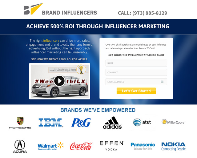
Brand Influencers are one of the worlds leading Marketing Influence agencies. Based in New York, Nashvile and San Francisco the company generates huge return on investment for clients including Ford, Coca Cola, Nokia, Porche and Addidas, name a few.
The Problem:
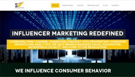 With a steady flow of qualified organic traffic arriving at the marketing agency’s one-page website, but no conversion tracking in place, the agency were unable to know how many profitable leads were being lost each day due to flaws in the existing site layout design, marketing message and lack of a strong calls to action.
As well as the ability to monitor the number of weekly visits and leads the landing page generated, Brand Influencers also needed an increase of traffic in order to split test alternate versions of their main landing page.
The Solution:
- Day 1 – Set up, contact forms and conversion tracking
- Day 2 – Landing page creation – using homepage content
- Day 3 – Adwords keyword research and ad campaign build
- Day 4 – Landing page variations creation and A/B testing
- Day 5 – Ad Group splitting and keyword bid optimisation
- Day 6 – CRO experiment results recording and analysis
Assigning the first day to creating all of the necessary Google Analytics, Adwords, Webmaster Tools, Optimizely and OptimisePress accounts and using WordPress plugins to create and configure a new contact us page and forms that redirect potential customers to tracked ‘thank you’ pages, I was able to benchmark our existing traffic and conversion rates. And also, to make informed recommendations on improvements and missed opportunities.
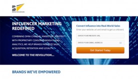 Next job was to create an improved version of the website homepage that included the same message as the original, alongside a new contact form that illustrated the benefits of requesting a free influencer marketing audit.
By monitoring engagement and conversion data from this first experiment, I was able to work alongside Brand Influencers’ CEO Jason Metz to produce a stronger proposition and more compelling marketing message in a second landing page variation.
With the Optimizely conversion optimisation testing tool, sending half of our paid traffic to the second landing page, we were able to note the increasing number of conversions generated from the reworded marketing message and placement of secondary elements.
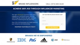 Because Brand Influencers get such great results that allows them to work with high-profile clients, we made sure the logos of the most well-known brand names were placed above the fold to ensure visitors were aware of the agency’s authority and trust levels whilst viewing the main proposition and online form.
The final landing page variation I created was included all the winning elements of the previous best converting page, only with a video in the main proposition area rather than a paragraph of descriptive text.
By testing each landing page variation against each other and with the site homepage recording our benchmark conversion rates, we were able to test our 3 main CRO hypothesis over the coming weeks while further optimising our paid search traffic and splitting our ad campaigns to send traffic to specific search markets further still.
By creating further variations of the landing page we were able to add more specific wording to better appeal to those searching for “influencer marketing”, “social influencers”, “facebook influencers”, “vine influencer”s, youtube influencers and “instagram influencers”. An ad campaign was created and configured to send highly targeted traffic to each of the landing pages – all of which were designed with the only the winning elements from each previous experiment.
Landing Page Elements
- Visible brand name
- Visible phone call to action
- Main navigation removed
- Uncluttered appeal area
- Main heading proposition
- Sub-heading explainer
- Enticing introduction copy
- Pop-up video case study
- Lead generation form
- Minimal form fields
- Call to action button
- Winning button text
- Authority client logos
- Confident sub-headings
- Informative explainer copy
- Valuable insider advice
- Relevant thumbnail images
- Case studies video gallery
- Professional quality clips
- Social proof video evidence
- Recogisable client brands
- Don’t miss out – threat
- Secondary sign-up form
- Split test form wording
- Action words in button
- Contact form area whitespace
- Testimonial quote graphics
- Result based testimonials
- Reviewer’s name and position
- Reviewer’s photo images
- Final call to action form
- Bright background colours
- Personal proposition copy
- Company location address
- Visible main contact name
- Action based CTA wording
- Copyright and disclaimer
Background functionality
- Redirected natural search traffic
- Targeted pay per click traffic
- Click to call phone numbers
- Fully responsive mobile design
- Tested in all main browsers
- Fast page and video load speeds
- Resized video pop-up boxes
- Form field error messages
- Thank you page form redirects
- All traffic sources tracking
- Paid search traffic monitoring
- Optimizely engagement tracking
- Goal conversions tracking
The Outcome
Results coming soon.
See more CRO case studies, view a range of CRO Packages or drop me a line for a free website CRO review and recommendations.


