Homepage Conversion Optimisation
Know for a fact what converts best…
Unsure how to use your website hompage to best encourage visitors to get in touch, sign up or buy your products and services? By A/B testing variations of the homepage layout and adapting marketing messages and calls to action to your main goals, you’ll be allowing your market tell you which page elements help generate more leads, sign-ups and sales.
Homepage Redesign CRO Case Study – Honest Betting Reviews
 Honest Betting Reivews is a UK based betting tipster service that helps website visitors bank profits using winning betting systems they have tried and tested.
The Problem:
The relatively new site generates affilliate commissions from visitors who join any of the recommended betting services under review. But without business goals and clear calls to action mapped to the website homepage layout, the company’s founder Daniel was unsure how to best encourage more paid search traffic to click affilliate links or sign up to the brand’s email list.

The Solution:
With just 3 days to ensure we generated better results from the stream of Adwords traffic, I planned a split conversion rate optimisation (CRO) design and experiment campaign that would increase sign ups and revenue from affiliate links within 30 days.
The short campaign would not only replace the generic slideshow with a new main “appeal” area (offering a free pdf download and email updates) in the homepage and sidebar, but also allow us to test conversion rates for further variations of the wording of the offer over the following months.
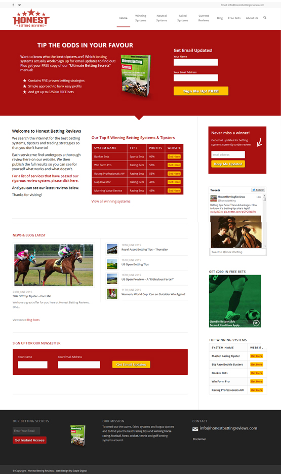
By integrating a new MailChimp subscribers list and opt in forms that deliver visitors to a tracked “thank you” page, visitors from the betting expert’s Adwords campaign would not only be providing valuable affilliate income but essential data on the brand’s target search market.
Using the Optimizely CRO A/B testing tool, we sent half of our homepage visitors to the existing homepage and half were redirected to the new version. This allowed to record some benchmark figures and reassured us that the new homepage workeed better than the old one.
By setting up secondary experiments to fine-tune the new homepage appeal and sidebar opt-in areas, we were able to find out for sure if their visitors prefered the offer of free betting tips email updates or a free pdf download. Then a third set of A/B spit tests with optimizely allowed us to measure if offering specific horse racing tips downloads was prefered to general tips from all sports.
The Conclusion
The winning layout
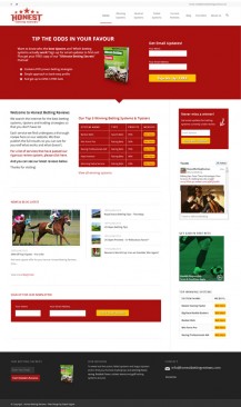
Conversion Rate Improvements
- New red main appeal area
- New heading proposition
- Sub-heading appeal copy
- Bulleted benefits list
- Pdf Download graphics
- Email list opt-in form
- Call to action button
- Tested cta button text
- Sidebar opt-in area
- Content footer opt-in area
- General footer download area
- Opt in form conversion tracking
- Mailchimp email list integration
- Automated blog post mailouts
- Homepage afilliate links list
- Mobile responsive opt-in forms
With a much better idea of exactly which paid keywords generated the cheapest coversions, Honest Betting Reviews were able to adapt their Adwords pay per click strategy and direct searchers of betting tips of particular sports to the most suitable landing pages – further increasing conversion rates and pulling more of their target market to the all important email subscribers list.
The Results
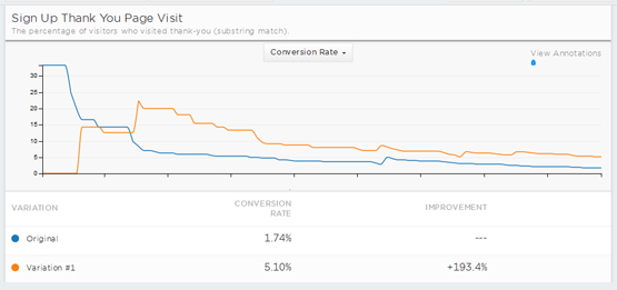
After a first month online that generated all but 2 sign ups for the monthly paid search spend, we were overjoyed to discover that our new design had generated a handful of sign-ups and some initial revenue from afilliate clicks every day. Then after another set of sign up form and design split testing…
I increased homepage conversions by +193%
The CRO Campaign Schedule
Here is how I packed the entire set-up, redesign and 3 rounds of conversion experiments into 3 days:
Day 1 – Set Up
- Google Analytics conversion tracking set up
- Mailchimp email list and opt in forms set up
- Optimizely A/B goal conversion testing set up
- Competitor website research and CRO training
Day 2 – Homepage Design / Development
- New homepage opt-in area design and creation
- Main “appeal” message formatting and graphics
- Newsletter/email updates opt-in form
- General betting download opt-in form
- Football betting download opt-in form
- Sidebar email updates form and thank you pages
Day 3 – A/B Testing (over the following month)
- A/B Experiment 1 – Old homepage versus new homepage
- A/B Experiment 2 – Newsletter versus pdf download
- A/B Experiment 3 – General versus racing download
- Goal conversion tracking, analysis and reporting
- Recommendations and implementing winning layout
The Client Tesimonial
Daniel was pleased with the quick turn-around of the new brand’s fate and requested further web development work to better present the betting systems they had reviewed and was happy to provide these kind words.
I am really pleased with the work he has done to improve my website and increase conversions. Highly recommended.”
Daniel – Honest Betting Reviews Founder
See more CRO case studies, view a range of CRO Packages or drop me a line for a free website CRO review and recommendations.


