Conversion Rate Consultancy
Stop leaks and remove friction for more sign-ups and sales
Taking a step back and seeing your website landing pages and squeeze pages from your customer’s point of view can be difficult. But with an extra pair for fresh eyes, some conversion rate optimisation insight and the latest split testing tools, converting more leads, sign-ups and sales from improved layouts or wording can be a straight forward process.
Conversion Rate Consultancy Case Study – uMoneyBook
 uMoneyBook is a new online money saving tool that pulls together the best deals from comparison websites and puts them all in one place – allowing members to get better deals on mortgages, savings accounts and investments, without having to add their bank details.
The Problem:
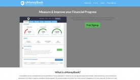
With a provisional website layout design and untested initial marketing messages in place, uMoneyBook’s founder Mandar Punaskar wanted to be sure that enough visitors to the site would be sufficiently encouraged to take the offer of free sign-up.
With a strategy in place to invest heavily in Adwords paid search traffic in order to generate a steady stream of targeted traffic, the website landing page needed to not only cover its costs, but to generate a profit via affiliate commissions.
The Solution:
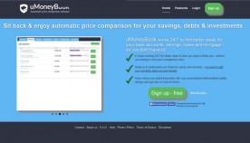 The landing page with improved messaging.
After discussing the project schedule and targets with Mandar on Skype, I proposed a campaign schedule totaling no more than 3 days, that would not only reword and redesign the homepage, but would test it against the original and new alternate versions, to see which version gained the most conversions.
With a number of basic improvements to be made to the Adwords campaign, I recommended that I take some time to train Mandar on the best uses of Adwords and of A/B split testing tools, such as Optimizely to continually optimise the page to generate a maximum number of sign-ups for each month’s Adwords spend.
The Improved Landing Page
- Mobile friendly top call to action button rather than text link
- Clear, specific proposition in main heading and sub-heading
- Increased whitespace around the hero image / slideshow area
- Bulleted list of benefits to help counter known friction points
- “FREE” call to action button positioned above the page fold
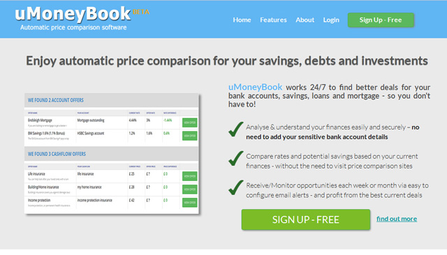 The landing page with improved copy and styling ready to be tested against further variations.
The Outcome
By clearly stating “what you get” and “why you should do it – now” in the main appeal area and by ensuring visitors on all devices could see the benefits list and call to action button, our engagement rates (number of clicks on the page) had shown to have increased significantly. And by creating further variations of the headline and proposition text, we were pleased to see that sign-ups to the free tool had also increased.
- Question and answer CRO consultancy services via Skype
- Hands-on marketing copy and web page layout improvements
- Best practice Adwords PPC and landing page optimisation
- Optimizely split testing experiments set-up and training
- Traffic and goal conversion tracking set-up and reporting
Using the available time and initial Adwords budget to best ensure uMoneyBook’s team would be able to continue the optimisation effort in-house, our campaign was shown to have worked well.
- Ability to test the proposed homepage form hypothesis
- Ability to test main appeal area colours and design layout
- Ability to test improved heading and page copy wording
- Ability to explore further profitable paid traffic niches
- Ability to track and monitor traffic and conversion rates
See more CRO case studies, view a range of CRO Packages or drop me a line for a free website CRO review and recommendations.


