A/B Split Testing CRO
Generate more business from your existing website traffic!
Unsure if your website’s sales proposition is written in a way that best encourages sales leads? (it likely isn’t). Want to know if your homepage includes psychological elements that compel them to give you a ring? Or need to have a trained eye point out all the friction points that are holding your site back? See below how A/B and multivariate testing proves for a fact what generates the most sales leads.
A/B Split Testing CRO Case Study – Wynnes Removals
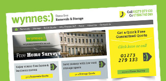
Wynnes Removals company grew from a single man in a van to a 10 man team and a fleet of vehicles via my SEO optimisation services – and are now a leading player in the local and national removals sector.
The Problem:
By having a friend of the family design their banding and website, Wynnes’ founder Laurence had a gut feeling that despite the site mentioning lots of the services they offered, it just wasn’t working to generate the sales leads he was expecting. He was right. The site had been designed by print designers who were more accustomed to doing graphic work for static posters and business cards – rather than developing a fine tuned marketing machine that turned visitors into sales.
- None responsive design – causing the site to be tiny in mobile devices
- Confusing header aread – with no strong clickable call to action button
- Overly wordy slideshow – hiding benefits points in slow loading slides
- No welcome message – forcing first time visitors to read tiny text blocks
- Flawed colour scheme – bright boxes but call to action text in dull grey
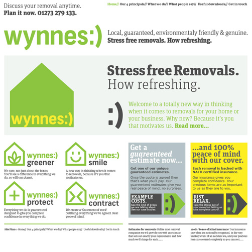 Flawed website design and colour scheme.
As well as the above misunderstanding of web design and marketing best practices and the design team’s insistance that the site would grow Wynnes’ business – the homepage lacked lists of benefits, trust elements such as client logos, social proof such as testimonials, friendly images of the team, repeated call to action buttons and click to call phone numbers that would help potential customers get in touch for a quick quote.
The Solution:
- Responsive web design with sidebars for listing benefits
- Quote request contact forms and buttons on every page
- Prominent click to call phone numbers above the page-fold
- Friendly intro text and images of the brand’s fleet of vans
- Customer testimonials and logos, checkatrade trust elements
- Repeated call to action buttons to encourage quote requests
- Branded footer area linking to the main areas of the site
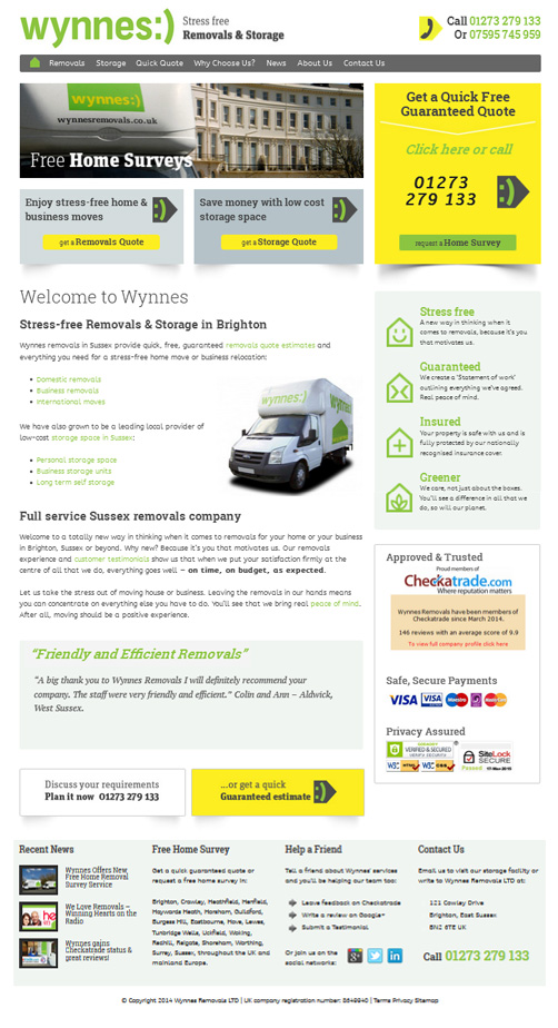 Website design using CRO best practices for maximum conversions.
Because it was unknown if visitors were more likely to fill out a quote request form that was on it’s own page, in the sidebar or both, or which call to action text generated more sales leads, we planned a 3 months of A/B split testing.
This method of conversion rate optimisation allows us to show one version of the page design to one set of visitors and another to the rest. By keeping the winning version live and then refining it in a multitude of further split tests, we were able to allow the market to decide which elements and wording worked best to generate maximum sales leads from our traffic each day.
The Results
Using the A/B Testing tool “Optimizely” always does the job and proves without a doubt which wording and design changes turn more visitors into sales. Our first test was to change the wording above the quote page contact form to highlight the fact that the price Wynnes’ quoted customers was the price they would pay – with no hidden extras guaranteed free.
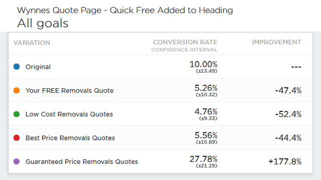 “Guaranteed price “quotes beats “quick” or “free” or “best” quotes
Another A/B split test we ran gave us conclusive results that showed us which order of the page elements encouraged more visitors to fill out the sidebar quote form. In this case, the original order I had redesigned won. So we stuck with it.
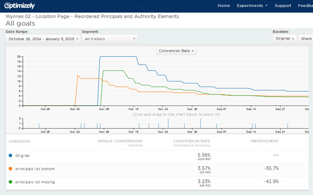 Changing the order of page elements generated less conversions
We had time to do 6 experiments in all, and each improvement added to the last so that a final test on which wording to use on our now highly refined sidebar contact form scored us another 10% more leads from our traffic
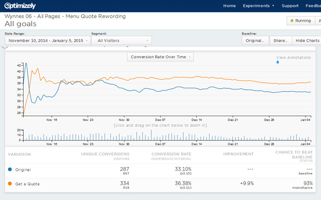 “Your free quote” beaten by “Get a quote” for menu link text
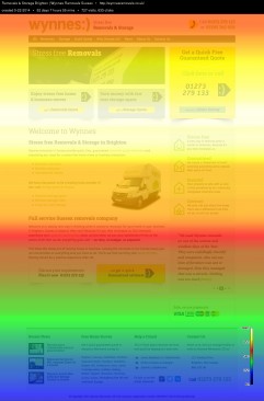 A/B split testing heat map results. Laurence was overjoyed with the results and because he had kept a tally of how many calls the site generated we were able to add those to the tracked conversions we generated from the quote forms to get an overall number of leads for every 100 visitors to the site.
From 2 leads per 100 visits to over 10 per 100 – we had surpassed our expectations by getting better than a 10% lead conversion rate. And because Laurence turned about a third of these leads in to highly profitable jobs, saw the business grow at a much quicker rate that we saw with the original site design.
As expected, the 3 days of work has paid for itself within 6 months and the more than doubling of the businesses generated was enjoyed every month since the work was completed.
Unfortunately, I parted company with Wynnes due to continued late payments. As expected more recent changes made to the site by a less experienced web marketing agency has caused conversions and growth to flop. However Laurence is now aware of the vast increases to be had by using experienced designers and marketers and if unsure what works best, always to split test in order to get the best results.
The Client Tesimonial
Laurence Wynne – founder of Wynnes Removals.
See more website conversion optimisation case studies and tips, see my CRO Packages or get in touch to see which particular elements are holding your site back from generating more online sales leads with a free website CRO review and report.


